Project Overview:
I worked with HealthCare Tele-Services (formerly known as Hospice on Call) team to help them with their rebranding efforts that included designing a user friendly, mobile optimized website with a modern look.
Stakeholders included the management team of HCTS. I was the lead to run the project from research and design, hiring contractors (illustrator, motion graphics designer, and a web developer,) managing the entire process ensuring deliverables are sent on time, feedback is taken into consideration, and iterations done based on feedback received.

The Problem:
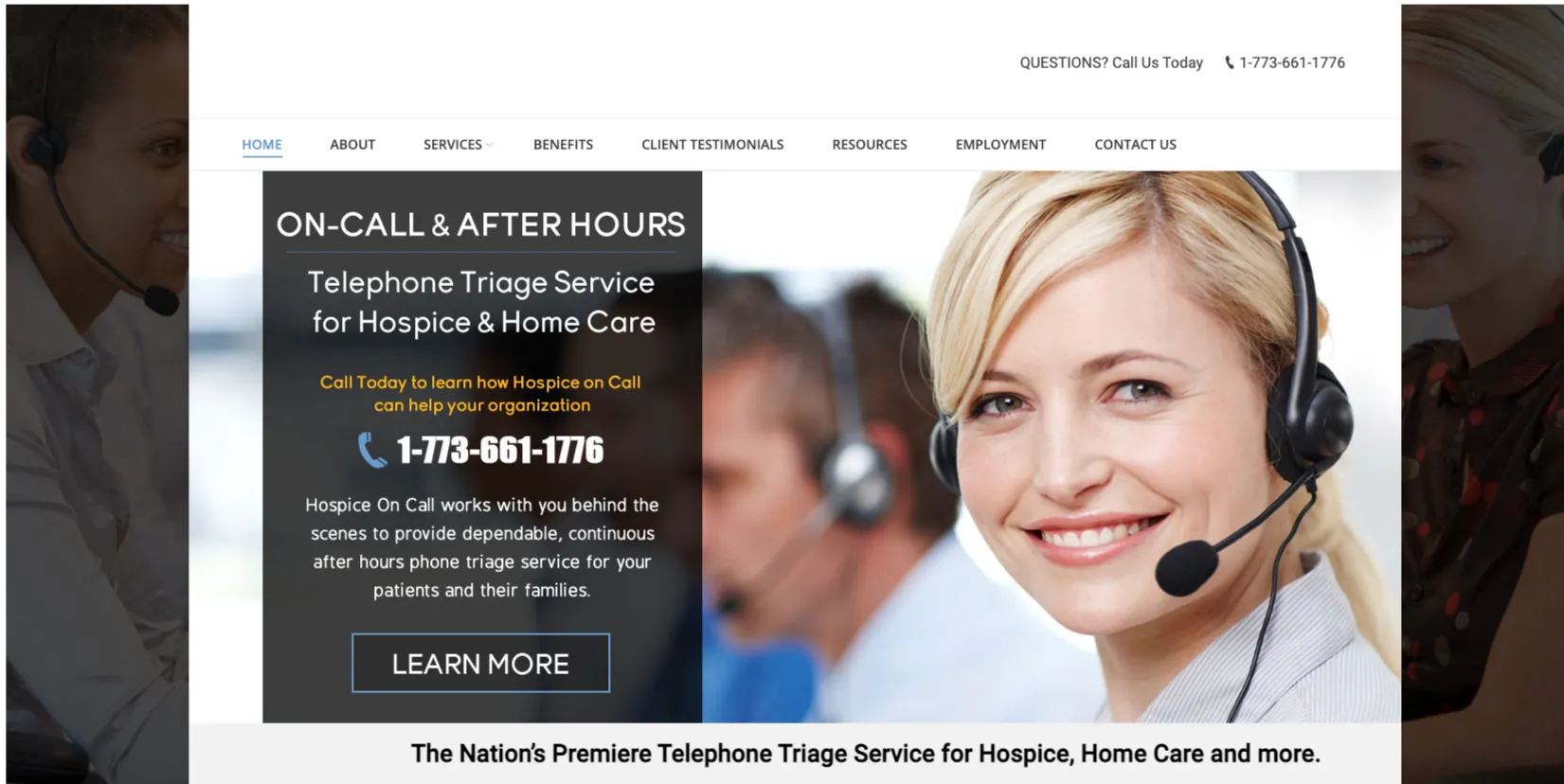
The old company website was outdated, built on a Wordpress theme that was slow, no dynamic content management, and not mobile optimized. (see below screenshot)
As the company grew, they started attracting bigger clients, as well as offering more services (in addition to hospice triage,) so they needed a website that better presented their value to potential clients.
Their old website was not dynamic as well, so it was costing them time and money to come up with content and manage the website. With the new website, we created it using Webflow CMS, which is one of the most user friendly CMS available for clients. Also, Webflow is hosted on AWS servers so websites are generally faster.
Screenshot of HCTS old website
Goals:
We wanted to make sure that the new website is modern looking, user friendly, and highlighting the full services that the company is currently offering.
For the modern look, we wanted a style that captures attention and engages the visitor.
In order to get a user friendly website, we wanted to create seamless interaction, simple content strategy, clean and breathable whitespace, optimized images, and high speed website. And from a client point of view, and easy to use CMS that makes their content creation and management process easier.
They will be able to create more content, add blogs, and manage that process much easier with the CMS layout.
Design Process:
Research & insight
The process included meeting with the project stakeholders from the client team to discuss their input and get an idea of the competition in their field. Afterwards, I started a competitive analysis taking a look at their competition websites and identifying what can be done better to stand out.
I also researched personas of customers that will be visiting the website, and identified the most successful styles that work for their customers and the industry.
The next step was coming up with a few style suggestions to present to the client, presenting a mood board of possible website layouts, colors, fonts, and themes. Their feedback was vital for the next steps in the design process.
Style selection
The client resources for this project were limited, so the best course of action to cut the cost but still deliver a high-quality result, was to find a template with a style that fits the earlier research findings, and present a vision of how we will repurpose the selected template and deliver a unique website.
The illustration style was the best fit for this project. Using vector illustrations are better for SEO (Search Engine Optimization) since vector files are generally small, do not lose quality when reducing image size, and also easier to reflect brand colors and styles.
That process ended with selecting a Webflow template that included a style guide, which we updated by researching and selecting the color pallets and fonts. The template also had a good number of section designs that I anticipated being able to replicate and improve using our unique style and assets.
(see below example of repurposing the template)
(Before)
(After)
Building the design
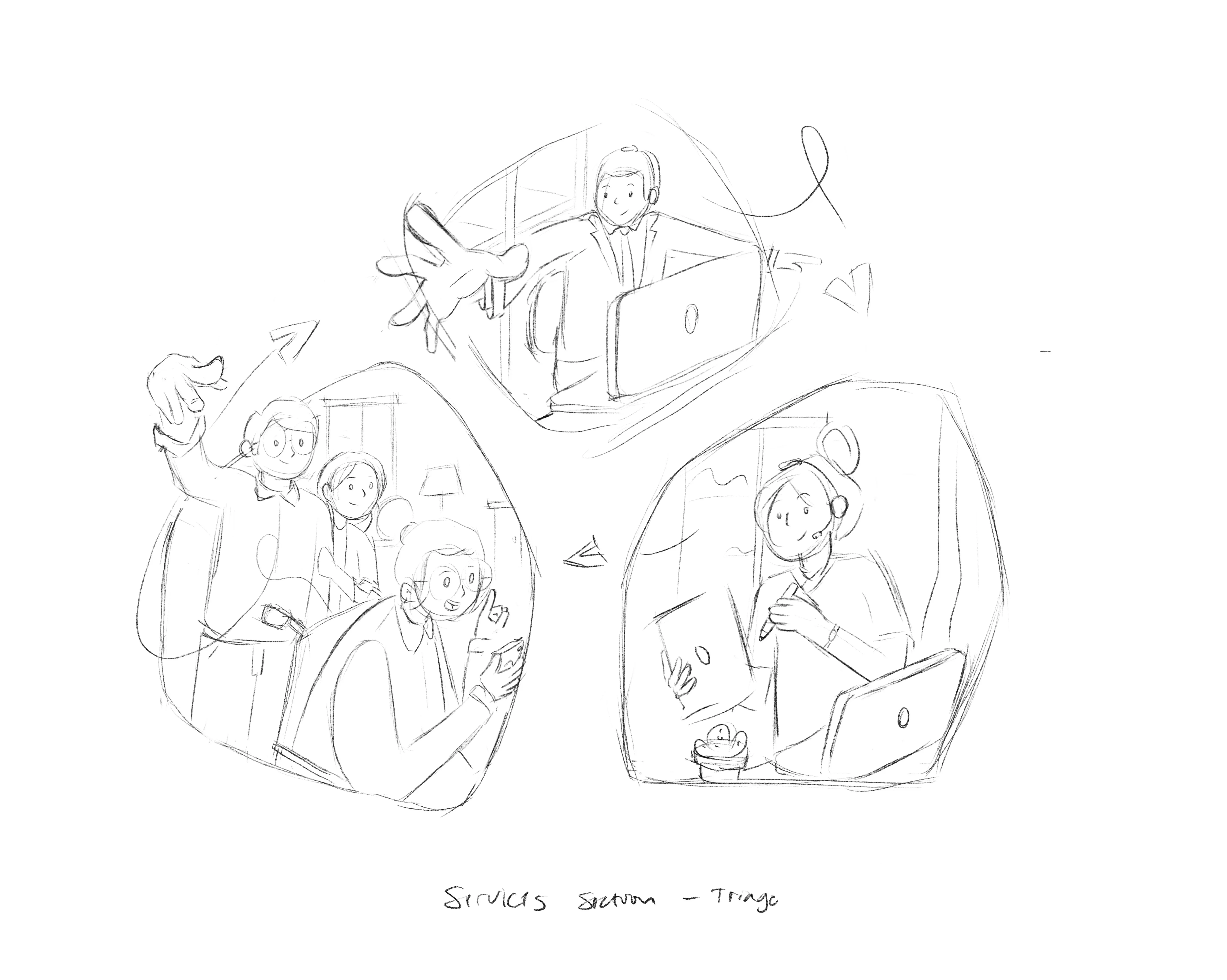
I used Figma and Webflow for this process. I designed a wireframe to generate a structure that we wanted to follow. I also hired a Webflow developer to help generate the CMS pages and collaborated on Figma for the layout designs.
HCTS first desktop wireframe on Figma

.svg)
Building on Webflow
Creative assets
Working on finding the best creative assets cost effectively was one of the challenges of this project. I spent a considerable amount of time searching for the best contractor for the job. I was very happy when I finally achieved that working with Arya. He produces beautiful work and he was within the budget.
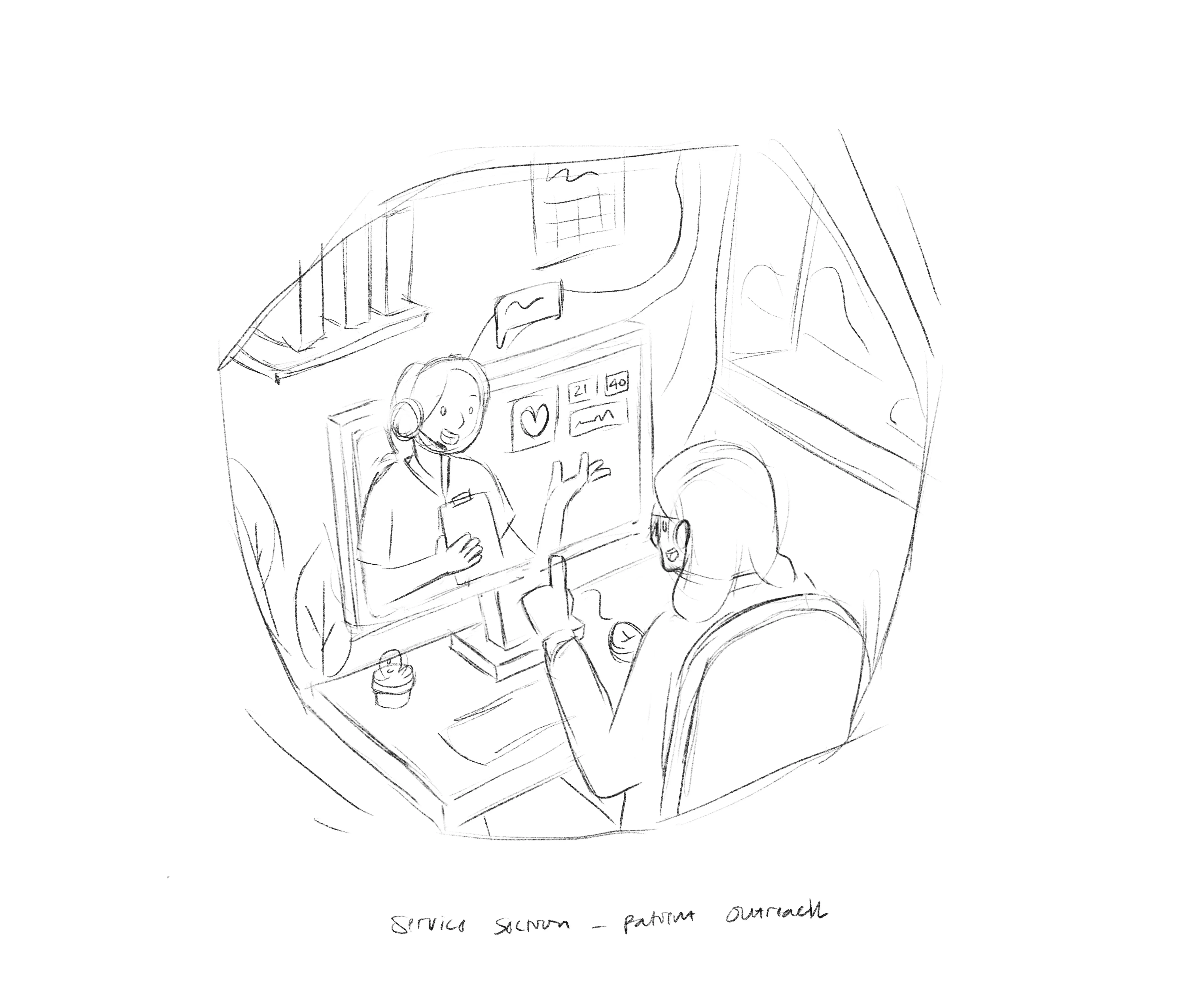
We worked on creating scenes based on the information collected from the client regarding their daily work and their team interaction with their customers providing medical and palliative care. We wanted to create scenes that best represent their team, their customers, and also in an equitable and inclusive manner. Check out the below early drawings and then the final work.
Early drawings

Final work

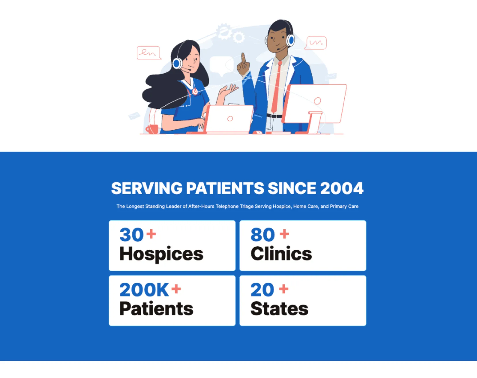
About us hero section with the illustration in use
.webp)
Testing and feedback:
The first round of testing was done when the wireframe was created. I shared it with the stakeholders who in turn shared with their decision makers who provided feedback based on what they think their customers would need.
The second round of testing took place when the desktop version was completed and we shared with the client for another round of comments. I ran a meeting with the stakeholders from the client team and asked them to perform individual tasks on the website, running through user journeys; like checking the services, sending an email, or calling the company. We finalized the desktop version after implementing all feedback on the two rounds of testing.
Then we moved forward with the mobile version and ran through the same testing process.
Result and final thoughts:
The project was a challenging but fulfilling process. Working with a tight budget but also producing quality work was the goal.
I learned a lot communicating with a diverse range of stakeholders from the client team, taking notes about the industry as well as the journey of the organization and the expansion of their services.
The budget did not allow for extensive usability testing, where we can get more feedback through the various steps of the work, but I did my best to replicate personas of website visitors by getting information from the client.
We worked with a logo presented to us by the client, animated it and worked around the logo colors to create a color palette that fits.
In conclusion, we were able to design a website that reflects the brand of the company, capture attention of website visitors, mobile optimized, and designed with usability in mind, to ensure the expanded services offered by the company are showcased with style.
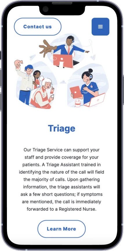
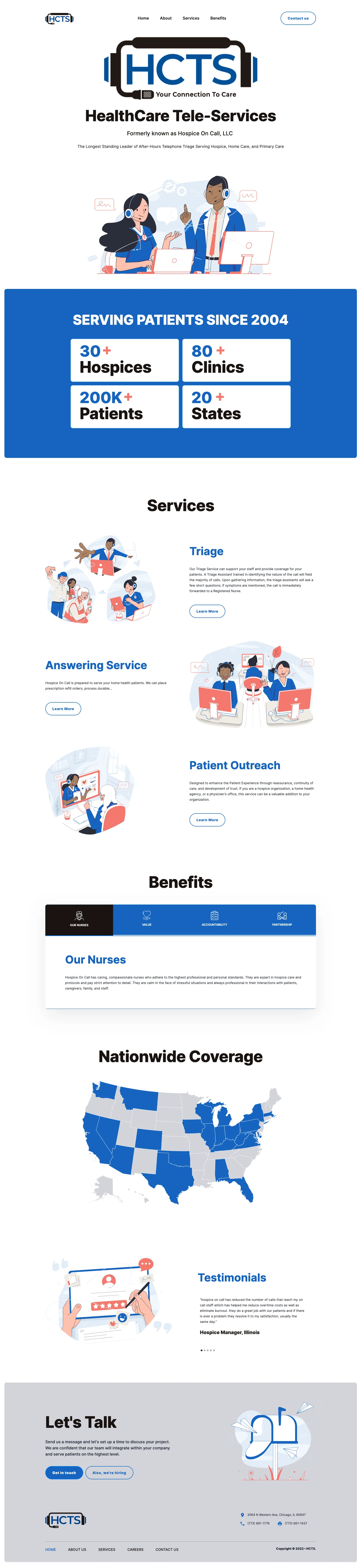
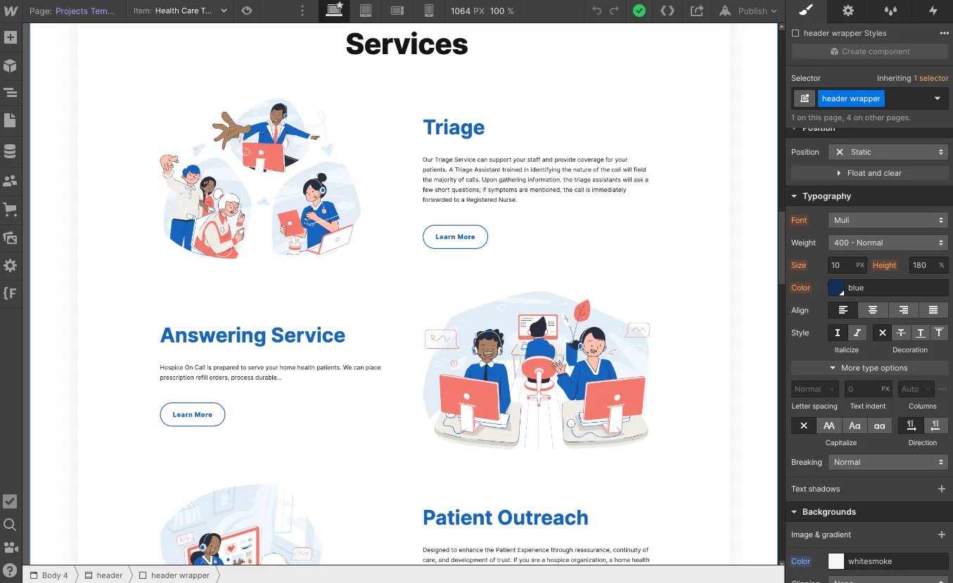
Checkout these final website image below. You can visit the live website here.
Thank you for reading!

.webp)